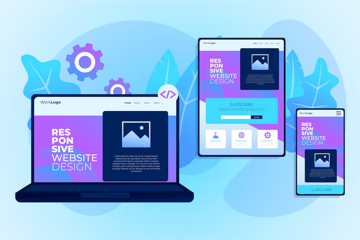
Your website will automatically adapt to all devices — mobile, tablet, and desktop — ensuring a smooth and professional user experience.
Features
Mobile-Friendly Layout
Your website will work perfectly on all mobile devices.
Fast Loading Speed
Optimized design for better performance and speed.
Cross-Browser Compatibility
Works smoothly on Chrome, Firefox, Safari, and more.
Clean & Modern Design
Professional and visually appealing layout
Easy Navigation
User-friendly structure for better experience
SEO Optimized
Designed to rank better on Google
What is Responsive Design?
Responsive design is a web design approach that ensures your website automatically adjusts to different screen sizes and devices. Whether your visitors are using a phone, tablet, or desktop, your website will always look clean, organized, and easy to use.
It improves usability, enhances user experience, and helps your website perform better across all platforms.